
Role: UI Designer, Web Developer
Date: April 2019 - May 2019
Links: Explainer Process Doc, Reference Site, Reference Site Process Doc
Flying While Trans is an immersive multimedia project that was created for CS 247: HCI Design Studio. The studio in which I was placed addressed the concept and issue of gender. For the first class project, we were tasked with creating an explainer for some gender-related topic, which we chose to be the problematic experience that transgender individuals experience when going through T.S.A.
What better way to help people understand an experience than placing them in the middle of it? This multimedia experience is tailored to be an installation in a contemporary museum. Outside of the experience, posters detail the installation as an immersive environment meant to share the stories of trans individuals while they travel. Content warnings outside of the room would warn people of the distressing emotional elements of the experience. Guests enter the room through a narrow entryway so as to avoid light leaking through. Inside, they encounter a long elevated pathway leading to a millimeter wave scanning machine. The room is essentially a black box, with the only illumination coming from the lights on the scanning machine as well as the video screens that take three of the four walls’ spans. As they step into the millimeter wave scanning machine, the machine lights up and simulates a pass over the individual. From that cue, the experience begins to unfold around them as the screen ahead of the machine begins to play. The synchronized videos play alongside a voiceover narrating the story of Sasha Costanza-Chock, a non-binary, transgender, femme professor from MIT, as she goes through the screening process.
After creating our explainer, we were then tasked with creating a reference site that provided further information about the transgender T.S.A experience. Utilizing content strategy, card sorting, and information architecture, we designed a website that we hoped would open our audience’s eyes and help to further people’s understanding of flying while trans.


Our process began with the team conducting preliminary and secondary research to determine our topic of choice. We began with the broad topic of gendered (physical) objects before conducting mindmapping interviews. After reviewing and discussing our notes from these interviews, we identified two topics, which we wanted to further research: ( 1 ) gender in language and ( 2 ) gender in marketing.

After identifying these two topics, we moved on to secondary research in hopes that it would help us decide which topic to tackle for the project. In the midst of our secondary research, however, I proposed to the team that we combine these two topics by looking into gender in travel, since travel involves cultural elements like language as well as marketing. With this proposal in mind, we completed our secondary research, discussed our findings, and identified a key insight regarding gender and travel: the idea of a gender-neutral approach to travel doesn’t exist. That is, travel that works for both men and women has yet to be achieved as linguistic and sociocultural factors continue to play a role in favoring straight, white males.
To make this point salient, we made concept models in an effort to make sense of the variety of factors that influence and are influenced by language, culture, and gender. After discussing our findings with our peers, we realized we were attempting to tackle too much at once, so we centered our focus on one aspect: travel. Specifically, we honed in on our research on women’s experiences while walking through the airport.
.png)
.png)
The ideation process for our explainer was primarily driven by our goal to fill the gap in people’s knowledge on the distinction between the male and female travel experiences. After discussing our individual ideas internally and with the class, we decided to play around with the following idea: a haunted house/escape room themed around women’s experiences as they walk through the airport. Some of the feedback that we received regarding this idea voiced concerns that this idea was “too extreme” as it only focused on the worst-case scenario.
As we were debating whether or not to tone down our haunted mansion/escape room idea, we recalled a New York Times article shared to us by our TA, which recounted the experiences of a trans man as they went through the T.S.A. security process. Shocked by the information presented in the article, we wanted to capture the narratives of transgender and non-binary individuals, rather than cisgender females, so that others could understand their discomfort. Though we were hesitant to make this jump, a quick pitch of our idea to our lecturer, Christina Wodtke, followed by her support, encouraged us to embrace the extreme and further explore the idea of capturing the airport experiences of trans and non-binary individuals. We took inspiration from one of our earlier ideas, a gendered museum, and decided to move forward with an immersive experience grounded in T.S.A. protocol that could be installed in a contemporary museum.


Prior to building our prototype, we conducted further research on trans/non-binary airport experiences, interviewing individuals who identified as trans/non-binary. Along the way, we were introduced to Sasha Costanza-Chock. In her competition-winning essay Design Justice, A.I., and Escape from Matrix of Domination, Sasha details one of her uncomfortable experiences of traveling as a non-binary trans femme individual. We were so moved by Sasha’s story that we decided (with her approval) to use her story as a framework to explore the trans non-binary airport experience.
Prior to building our prototype, we conducted further research on trans/non-binary airport experiences, interviewing individuals who identified as trans/non-binary. Along the way, we were introduced to Sasha Costanza-Chock. In her competition-winning essay Design Justice, A.I., and Escape from Matrix of Domination, Sasha details one of her uncomfortable experiences of traveling as a non-binary trans femme individual. We were so moved by Sasha’s story that we decided (with her approval) to use her story as a framework to explore the trans non-binary airport experience.
After presenting this prototype to the class, they suggested that we supplement the video with statistics and facts about T.S.A. to aid the experience. As a result, we conducted additional research about the transgender/non-binary experience with T.S.A and included our findings in our video.
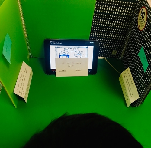
As with any prototype, we needed to test our assumptions and gauge whether we succeeded in creating an explainer. We focused on the following:
The feedback we received was overwhelmingly positive and most of the suggestions that were given involved stylistic choices and accessibility, such as including color in the graphics and captions. While all our participants established a better understanding of the trans experience through T.S.A., their opinions differed on the necessity of a gendered T.S.A. screening protocol. With such a wide range of opinions, we find that our explainer has the potential to not only raise awareness of transgender experiences throughT.S.A., but also start up conversations on how to respond to such information, which we found super encouraging.
The first step of our process was to design a content strategy that would outline our message architecture, branding, and content type. We felt that our site should represent the importance and sensitivity this topic has to those who are affected by it. We brainstormed a variety of adjectives that would represent the message of our site, settling on the following: serious, perturbing, eye-opening, compassionate, and simple.
During this step, we also brainstormed the type of resources with which we wanted to fill our site. In order to help our target audience explore and understand our topic, we focused on contemporary information that provided greater context on the issue. We gathered websites and articles on millimeter wave scanning technology, statistics about transgender people in the U.S., official statements from the TSA, and the history of actions on this issue. In addition, we gathered a large number of personal stories as well as articles reporting on these individual experiences. Moreover, we found non-profit organizations that actively address this issue.
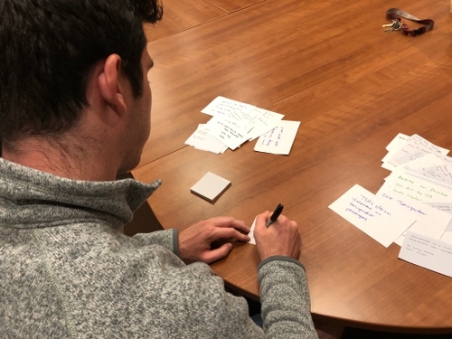
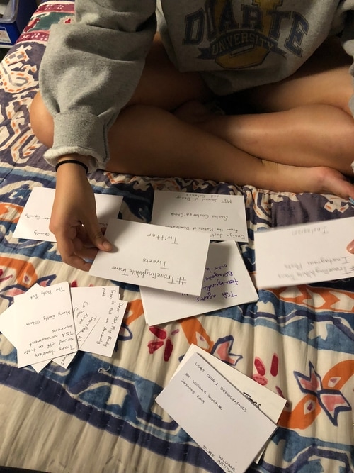
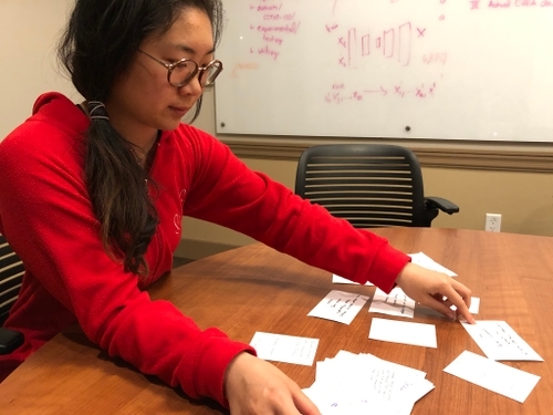
With all of our sources collected, we had to ask: what was the framework that our users were approaching this issue with? To explore this, we conducted open card-sorting tests in which we had participants freely sort our sources into categories that they defined during the process.
From these card sorts, we gathered interesting insights about emerging patterns. In general, we noticed that certain categories would repeatedly surface between different participants, particularly in distinguishing between first-hand accounts and secondary sources. The most common response we had was that most participants didn’t have a strong grasp on the definition of transgender. While they felt they could effectively sort the cards into clear groups, our participants wished they had more background information on the subject in order to understand both the topic and the articles they were sorting.
From the card sorts, we created an initial site map, taking into consideration the most common categories. We then further fleshed out the hierarchy of the site by synthesizing our initial site map and feedback from the class, eventually deciding on the following 6 main pages:
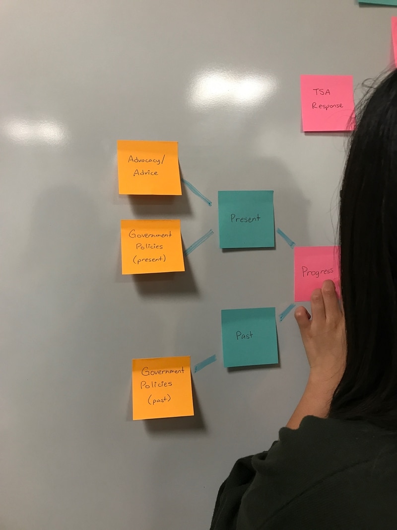
After receiving feedback on our category titles in class, we realized that we used problematic and loaded terms, such as “Progress” and “Actions to Take,” which detracted focus from our overall message. We changed these titles to “History” and “Next Steps,” respectively. Additionally, we changed “Technology” to “The Scanner,” as the former title was too broad.
With our content strategy and information architecture defined, we started to sketch out what we wanted the actual site to look like. The majority of our attention was put towards the layout of our web pages to ensure that we were presenting our information and sources in the most organized and effective ways possible. Following our sketches, we took to WordPress to create the reference site, customizing the CSS of individual components to achieve our desired design.

For our explainer, I was charged with editing the three videos together, which was difficult because I had to make sure that the two "side" videos were properly synchronized with the "main" video. For the reference site, I was one of the main web developers and did most of the customization to achieve the sketched design. Throughout both projects, I played my part in all of the user interviews, primarily serving as the note taker but also conducting my own interviews.